
Services
New to IV Therapy? Be sure to ask about our special offer just for you. Our concierge team is ready to assist you in selecting the perfect time and drip to meet your needs.
Call or text us or download the app to book:(310) 295-2075
Call or text us to book:(310) 295-2075
Request Complimentary ConsultationDownload the app
Bioidentical Hormone Therapy for Men & Women
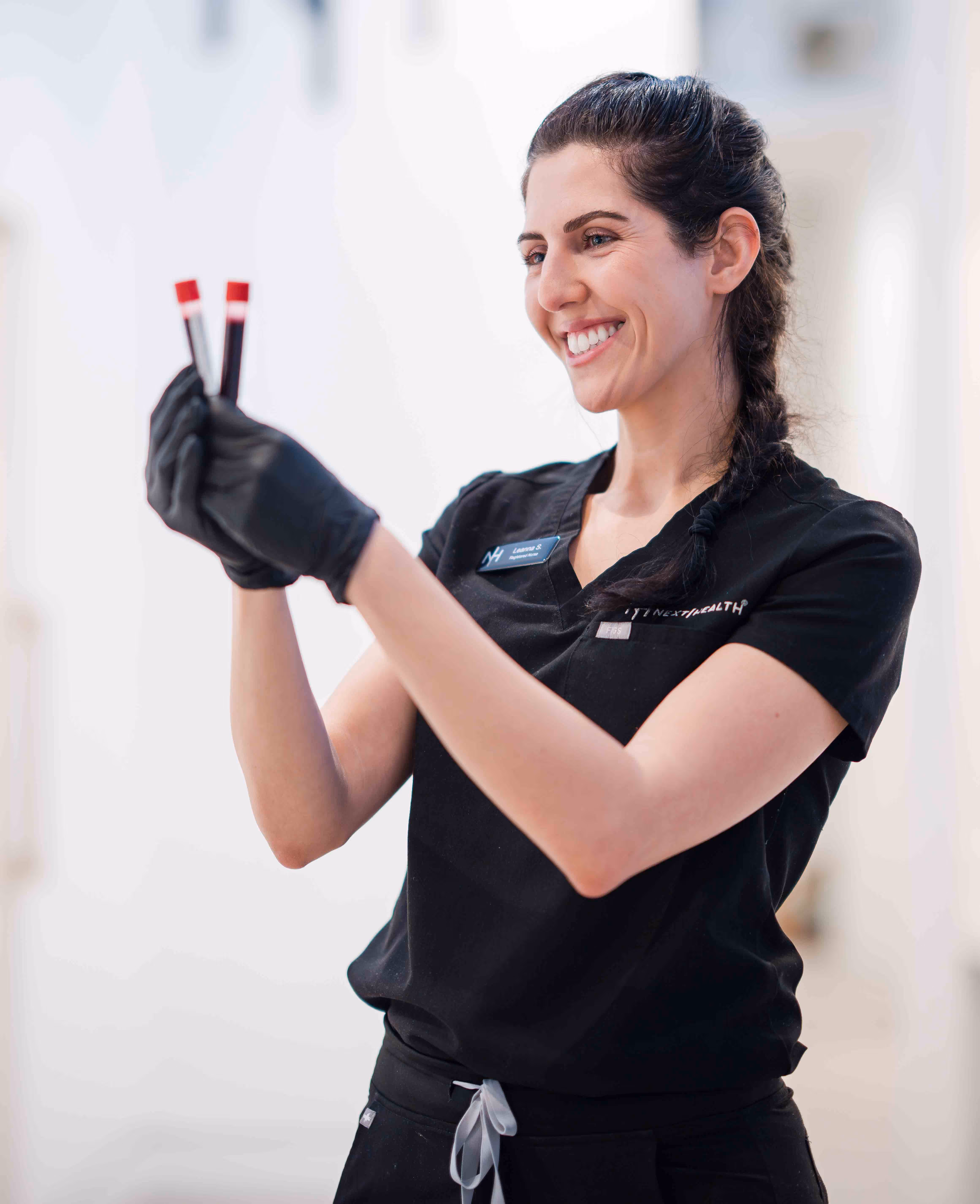
Quarterly Hormone-Monitoring Blood Work
Personalized Wellness Plan
Quarterly One-On-One Medical Provider Consult


Potential benefits include:
Strengthen Immunity | Enhance Energy | Clear Brain Fog | Look & Feel Your Best
MENU
Naturally restore your hormone levels to enhance your overall health with Bio-Identical Hormone Therapy.
Hormones are how your cells communicate. How “young” you feel is determined by how your cells relay information to each other for bodily functions. As messenger signals, hormones help send information about hunger, hair growth, weight management, energy, appearance of skin, and more.
Over time, hormone communication becomes compromised due to the air pollution in cities, toxins we expose ourselves to with household products, lack of sleep, travel, and more.
By restoring your hormone levels before such disturbances occurred, you will feel empowered with more energy, vitality, and a newfound sense of wellness.
Start by testing your hormone levels with the Next Health Baseline Test.

.webp)
NAD+ is an essential coenzyme present in every cell within our bodies. It acts as a key player in cellular energy production, particularly within our mitochondria—the powerhouse of the cell. Think of NAD+ as the fuel that keeps our cellular engines running smoothly.
When we're young, we naturally have abundant levels of NAD+, which contribute to our boundless energy and vitality. However, as we age, our NAD+ production naturally diminishes, resulting in a 40% reduction by the time we reach 40 years of age. This decline is a key contributor to the common signs of aging (think wrinkles, decreased mobility, reduced mental clarity, and low energy).
By replenishing NAD+ levels with an NAD+ Drip, we can potentially boost cellular energy production, leading to increased vitality and a reduction in age-related symptoms.

NAD+ IV Therapy replenishes your body's supply of this energizing coenzyme. By restoring and increasing your levels of NAD+, you charge your cellular batteries, enhancing your overall health and longevity.
NAD+ IV Therapy stands out as the most effective method to revive your NAD+ levels. By bypassing the digestive system, it ensures that 100% of this essential nutrient is directly delivered to your bloodstream, offering you a potential direct and immediate boost in cellular energy. This optimized approach empowers you to feel healthy and vibrant for a longer period of time.
NAD+ Therapy is considered a "slow drip process". This service commonly takes between 2-3 hours but you can choose the pace that feels best for you.
At Next Health, we offer NAD+ IV Therapy from the comfort of our modern and vibrant IV Lounge or a private room.
Our IV Therapy Lounge is complete with phantom full-body massage chairs, comfy leather seating, heating pads, charging stations, and the best brain wave therapy, NuCalm, to recharge and reboot your brain health.
NuCalm is known as an all-natural stress relief technology that works with the brain’s inherent calming systems and functions.You can now enjoy NuCalm technology while getting an IV Drip.
A 20-minute NuCalm session is like a 1-hour nap.
NAD+ IV Therapy at Next Health is the new date night, meeting, and self-care experience you’ve been wanting.
Available in West Hollywood, Century City, New York City, Maui, & Studio City
For those seeking the best NAD+ supplement, look no further than our NAD+ Drip Therapy. Our experts recommend the Optimal Aging Trifecta, a regimen that involves three NAD+ infusions (300 mg or 750 mg) over seven days.
This strategic schedule is crafted to amplify the benefits of NAD+ Therapy. Many individuals suffer from depleted NAD+ stores, and our trifecta approach allows you to front-load your treatment, ensuring optimal results.
This approach provides a mental and physical reboot through NAD+ Drip Therapy, helping you experience the full advantages of the treatment.
NAD+ is an essential coenzyme present in every cell within our bodies. It acts as a key player in cellular energy production, particularly within our mitochondria—the powerhouse of the cell. Think of NAD+ as the fuel that keeps our cellular engines running smoothly.
When we're young, we naturally have abundant levels of NAD+, which contribute to our boundless energy and vitality. However, as we age, our NAD+ production naturally diminishes, resulting in a 40% reduction by the time we reach 40 years of age. This decline is a key contributor to the common signs of aging (think wrinkles, decreased mobility, reduced mental clarity, and low energy).
By replenishing NAD+ levels with an NAD+ Drip, we can potentially boost cellular energy production, leading to increased vitality and a reduction in age-related symptoms.
NAD+ IV Therapy replenishes your body's supply of this energizing coenzyme. By restoring and increasing your levels of NAD+, you charge your cellular batteries, enhancing your overall health and longevity.
NAD+ IV Therapy stands out as the most effective method to revive your NAD+ levels. By bypassing the digestive system, it ensures that 100% of this essential nutrient is directly delivered to your bloodstream, offering you a potential direct and immediate boost in cellular energy. This optimized approach empowers you to feel healthy and vibrant for a longer period of time.
NAD+ Therapy is considered a "slow drip process". This service commonly takes between 2-3 hours but you can choose the pace that feels best for you.
At Next Health, we offer NAD+ IV Therapy from the comfort of our modern and vibrant IV Lounge or a private room.
Our IV Therapy Lounge is complete with phantom full-body massage chairs, comfy leather seating, heating pads, charging stations, and the best brain wave therapy, NuCalm, to recharge and reboot your brain health.
NuCalm is known as an all-natural stress relief technology that works with the brain’s inherent calming systems and functions.You can now enjoy NuCalm technology while getting an IV Drip.
A 20-minute NuCalm session is like a 1-hour nap.
NAD+ IV Therapy at Next Health is the new date night, meeting, and self-care experience you’ve been wanting.
Available in West Hollywood, Century City, New York City, Maui, & Studio City
For those seeking the best NAD+ supplement, look no further than our NAD+ Drip Therapy. Our experts recommend the Optimal Aging Trifecta, a regimen that involves three NAD+ infusions (300 mg or 750 mg) over seven days.
This strategic schedule is crafted to amplify the benefits of NAD+ Therapy. Many individuals suffer from depleted NAD+ stores, and our trifecta approach allows you to front-load your treatment, ensuring optimal results.
This approach provides a mental and physical reboot through NAD+ Drip Therapy, helping you experience the full advantages of the treatment.

NAD+ stands for nicotinamide adenine dinucleotide, is an essential coenzyme present in every cell within our bodies. Increasing NAD+ levels through NAD+ Drips can enhance cellular energy and function, leading to a myriad of benefits.

Peptides are short-chain amino acids that act as messenger signals in the body that improve cellular function.

There’s practically a peptide for every health focus you may have: energy, immunity, muscle recovery, and so much more.

Peptide Therapy does not require the assistance of a medical professional. Our easy-to-use method can be done from the comfort of your home.

Our policy requires medical consultation and recommendation from a licensed provider for peptide therapy.

Upon ordering, our medical provider will contact you within 1 business day to discuss your prescription and how it works.

Your package will arrive with protected and discreet packaging. Your package will include one vial of Peptides, syringes & medical supplies.

Self-administering peptides is a quick and easy process You can refer to the instructional video located above or instructions tab in your package.
Looking to target specific health goals such as more energy, hair growth, or muscle mass?
Peptide Therapy may be the perfect solution for you. Because peptides act as messenger signals throughout the body, they can be used to support the communication of various cells.
Peptides may support the cells involved in metabolic function, repairing tissue, hormone production, and more.
*Some restrictions apply. Product availability subject to change without notice. Lab work and medical clearance are required for peptides.
BPC-157 Oral
Gut health repair
DSIP
Sleep enhancement
Kisspeptin
Fertility & sex drive
Melanotan
Sex drive
PT-141
Sex drive
Mots-C
Weight Loss
Semax
Increase performance and stamina
Cerebrolysin
Neuroplasticity, focus, & learning
CJC-1295 / Ipamorelin
Decrease visceral fat / Improve lean muscle
HCG
Improve testosterone
Selank
Improve memory & learning
Tesamorelin
Decrease visceral fat
Tesofensine
Weight loss (oral)
AOD 9604
Bone and cartilage repair
Copper (GHK-CU)
Optimal aging (dropper)
Copper (GHK-CU)
Hair growth (injectable)
Peptides harness the power of your body’s natural ability to heal and improve itself. Did you know there are over 7,000 peptides that occur naturally in the human body?
Peptides may seem cutting-edge, but scientists have been utilizing the power of peptides since the 1920s. In fact, the first peptide therapy was aimed to support the production of insulin for diabetic patients.
Today, health optimization and longevity experts are able to use various peptides to target body functions to optimize them:
Next Health has researched and vetted the best licensed manufacturers and offers comprehensive peptide treatment protocols.


We're dedicated to providing you with the highest quality IV therapy services available. Unlike standard IV experiences that often use saline as the base and charge extra for additional vitamins and minerals, we believe in offering comprehensive care from the start.
We start with lactated ringers and our potent Myers Cocktail base. But it doesn't stop there. Each IV includes vitamin C, magnesium, zinc, copper, chromium, calcium, and more. From there, we tailor additional vitamins and minerals to meet your specific needs, from immunity to skin health.
Potential benefits include:
Not sure which IV you'd like to book? Contact us today and one of our medical professionals can go help you make your selection.
Available in Nashville, Century City, West Hollywood, New York City, Studio City,& Maui
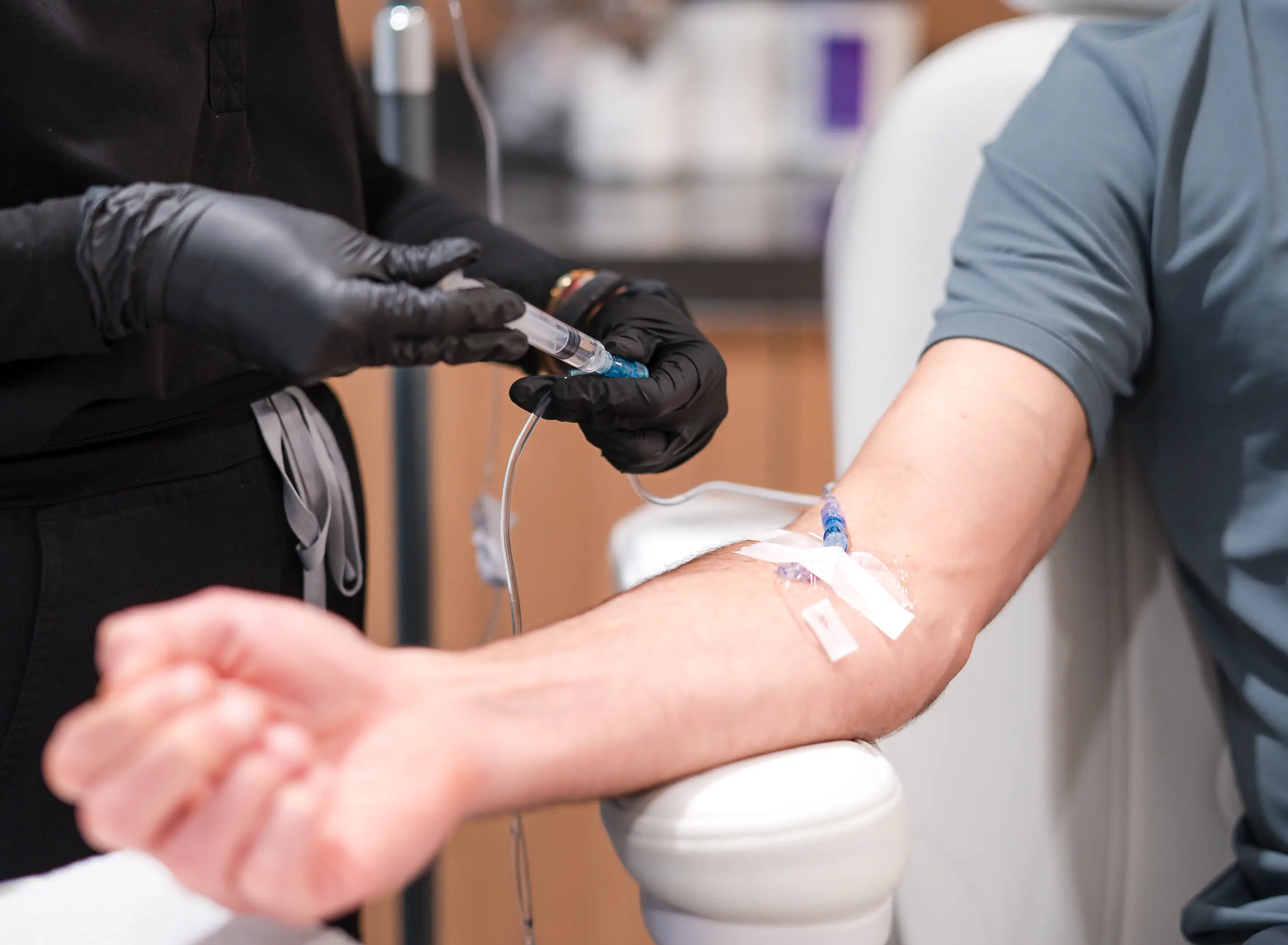
Intravenous IV Therapy has been popularized as the fastest way to deliver medications into the bloodstream to help with various health conditions, dehydration, and blood transfusions. Now, it is available to ensure maximum absorption of essential vitamins, minerals, and electrolytes to optimize your health.
The purpose of IV Vitamin Therapy is to deliver powerful nutrients directly into your bloodstream, so your body may effectively utilize these building blocks to take your health to the next level.


IV Lounge is complete with phantom full-body massage chairs, comfy leather seating, heating pads, charging stations, and the best brain wave therapy NuCalm to recharge and reboot your brain health.
NuCalm is known as an all-natural stress relief technology that works with the brain’s inherent calming systems and functions. You can now enjoy NuCalm technology while getting an IV Drip.
A 20-minute NuCalm session is like a 1-hour nap.
IV Therapy at Next Health is the new date night, meeting, and self-care experience you’ve been wanting. 30-45 minutes next-level, healthy experience.
IV Therapy Drips at Next Health are $199 for non-Members. If you join as a Member, you can enjoy 2 IV Vitamin Drips every month for $299 per month. This is our most popular Membership because it also includes 2 Vitamin Shots, Cryotherapy, Infrared LED Therapy, Hyperbaric Oxygen Therapy, InBody Scan, VISIA Scan, Baseline Test, and more.

The fastest way to hydrate is through intravenous (IV) therapy. IV therapy involves delivering fluids directly into the bloodstream, bypassing the digestive system and allowing for rapid absorption of fluids and electrolytes. IV therapy can quickly replenish fluid and electrolyte levels, restoring hydration and promoting overall well-being in a matter of minutes.
In general, you can expect any fluids from an IV drip infusion to remain in your body for a couple hours after absorption. If you are well hydrated and haven’t urinated recently, you may pass some fluids more quickly than if the reverse is true (keeping in mind most people are dehydrated and many do not even know it). However, IV fluids don’t usually stay in your body for more than several hours.
The vitamins, minerals, and other nutrients in any given Next Health IV Drip will remain in your body for days, weeks, or months to come. It all depends on what exactly your body needs and what type of infusion you choose.


Discover the Benefits of IV Vitamin Therapy at Next Health:
Pros:
Immediate Nutrient Absorption: IV therapy delivers vitamins and minerals directly into the bloodstream, ensuring rapid and effective absorption for immediate results.
Tailored Treatments: Our IV therapy treatments can be customized to address specific health goals, from boosting immunity to enhancing energy levels and promoting overall well-being.
Hydration Support: IV therapy provides hydration along with essential nutrients, helping to replenish fluids and electrolytes for optimal hydration.
Enhanced Wellness: Many clients report feeling rejuvenated, energized, and revitalized after IV therapy sessions, experiencing improved mood, focus, and vitality.
Cons:
Time Commitment: IV therapy sessions typically last between 45-60 minutes. If you're seeking a quicker appointment, consider booking a Vitamin Shot for a faster option.
Minimal Discomfort: Some individuals may experience minor discomfort at the injection site, such as bruising or swelling, which typically resolves quickly.
Rare Risks: While rare, allergic reactions to certain ingredients in the IV solution can occur. It's essential to inform our healthcare team of any allergies or sensitivities before undergoing IV therapy.
When it comes to IV Therapy, the duration can vary depending on factors such as the type of IV treatment received, individual metabolism, and hydration levels. For a detailed explanation on the duration of IV therapy and its effects on the body, we encourage you to explore our blog post: How Long Do IV Fluids Stay in the Body?
.jpg)
What Is IV Nutrition Therapy?
Our IV Nutritional Therapy delivers a potent blend of pure, concentrated ingredients directly into your bloodstream for maximum effect. With every Next Health IV Drip, you'll receive our signature Myers Cocktail IV, ensuring you experience a replenishing and revitalizing infusion of essential vitamins and minerals.
What Are The Potential Vitamin IV Therapy Side Effects?
Potential side effects of Vitamin IV Therapy may include minor discomfort at the injection site, such as bruising or swelling. In rare cases, individuals may experience allergic reactions to certain ingredients in the IV solution.
What Is IV Hydration Therapy?
Our IVs begin with lactated ringers, a hydrating blend of fluids and electrolytes that surpasses the standard saline bag for optimal hydration. Research shows that 75% of people are chronically dehydrated, according to the National Institute of Health. Elevating your hydration levels with IV hydration can empower you to perform at your peak. Proper hydration not only enhances cognitive function, but it also promotes healthier skin, improved metabolism, and overall well-being

Naturally restore hormone levels with bio-identical hormones “molecularly identical” to your own, and a customized wellness plan to suit your lifestyle and needs.
We're dedicated to assisting you in restoring and balancing your hormone levels, unlocking benefits such as improved energy, enhanced sleep, effortless weight maintenance, and a path towards enhanced longevity.
We offer personalized hormone optimization plans for men and women as part of all Medicine 4.0 memberships.
Our approach, crafted by a team of Functional Medicine Experts, goes beyond a one-size-fits-all prescription.
Your path to well-being is as unique as you are, and we're here to support your individual health goals.
Become a Next Health Member
Our monthly Medicine 4.0 memberships include exclusive access to the latest in bioidentical hormone replacement therapy for men and women.
Access Functional Lab Testing
Once you become a Next Health member, your journey begins with a preliminary Baseline Lab Test (included in the membership), a comprehensive assessment of over 50 biomarkers designed to establish a foundational understanding of your current health status.This advanced biomarker test allows both you and your Medical Provider to make a data-driven decision on the hormone optimization plan that is best suited for you.
Receive Personalized Wellness Plan
Based on your unique health data and needs, a Medical Provider will prescribe varying forms of bioidentical hormone therapy–including creams, oral tablets, and pelleting. You will also receive a fully customized wellness plan with lifestyle suggestions and advanced therapy recommendations to help optimize your energy, balance your hormones naturally, and support long-term health and vitality.
Consistently Track & Monitor Biomarkers
Each Medicine 4.0 Membership includes access to quarterly biomarker and functional lab testing and quarterly one-on-one consults with a Medical Provider to monitor and track your hormones, and make adjustments to your personalize health plan as needed.
*Please note that a Medicine 4.0 membership is required to access hormone optimization; prescriptions are provided separately.

Hormone Optimization is a key component to maintaining a high quality of life and improving longevity.
In men, increasing testosterone and reducing estrogen levels can increase lean muscle mass and bone density and reduce fat mass, which is crucial for maintaining a healthy body composition. In addition, optimizing testosterone levels can improve sex drive and mood.
For women, optimizing hormone levels, especially post-menopause, is crucial for improving quality of life. Balancing female hormones will improve mood, decrease unwanted side effects like weight gain, vaginal dryness, and hot flashes.By restoring and optimizing hormone levels, you can experience benefits such as:
Testimonials reflect individual experiences and results may vary. Your personal health outcomes will depend on your unique needs and circumstances.


